Bank service
Creating a comprehensive service that allows users to quickly find a suitable bank branch based on their preferences and needs. The project included UX and UI design aimed at improving navigation and personalizing the user experience.
Client
A bank interested in creating a web and mobile service to simplify the process of selecting a branch for individuals and legal entities. The goal was to make interaction with the bank more convenient and user-oriented by offering personalized recommendations.
Business goals
Improving customer service
Reduce the time that customers spend searching for the right bank branch and making an appointment.
Increase in the attendance of departments
Create a tool that helps users find the nearest and most convenient branches, thereby increasing attendance.
Personalized experience
Provide customers with recommendations based on their location, time, and preferences.
Tasks
Defining key criteria for choosing a bank branch
Problem
Users often faced difficulties in finding the right department without knowing the exact criteria for selection.
Solution
A study was conducted on user needs to identify the main factors influencing the choice of department, including location, hours of operation, available services, and queues.
Creating an intuitive interface
Problem
Old interfaces of banking services were often overloaded with information and difficult to use, especially on mobile devices.
Solution
A simple and intuitive interface has been developed, allowing users to easily search and filter departments, as well as quickly sign up for consultations.
Responsive design for mobile devices
Problem
Many users access the service through mobile devices, and an inconvenient interface can reduce their loyalty.
Solution
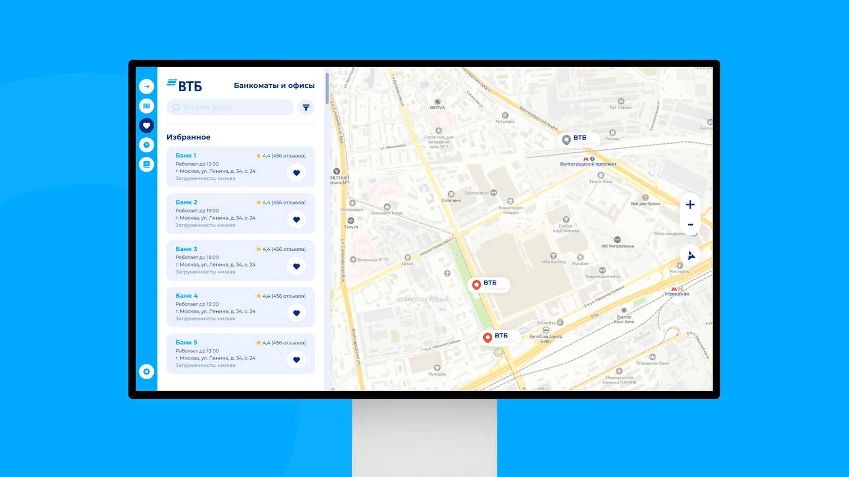
Adaptive design has been implemented, which displays correctly on both desktops and smartphones, providing an optimal user experience across all platforms.
User Research
and Insights
Target audience
Young users: They actively use mobile devices and appreciate quick service.
Older users: They prefer a clear and simple interface that is not overloaded with unnecessary details, and often choose branches with the shortest queues.
The main needs of users
Convenient search for the nearest branches considering geolocation and filters.
The ability to quickly make an appointment or consultation at the selected branch.
Detailed information about available services, promotions, and the specifics of the operation of each branch.
Persons
Ivan (28 years old) — Young specialist
Goals: To find the nearest bank branch to quickly resolve issues related to loans or accounts.
Pain points: Long waiting times and lack of information about available services hinder him from effectively planning his affairs.
Elena (60 years old) - Retiree
Goals: Find a department where she can conveniently and quickly resolve her issues with minimal waiting times.
Pain points: Complex interfaces make it difficult to find the necessary information, especially if one needs to schedule an appointment.
Design solutions
Interactive maps and filters
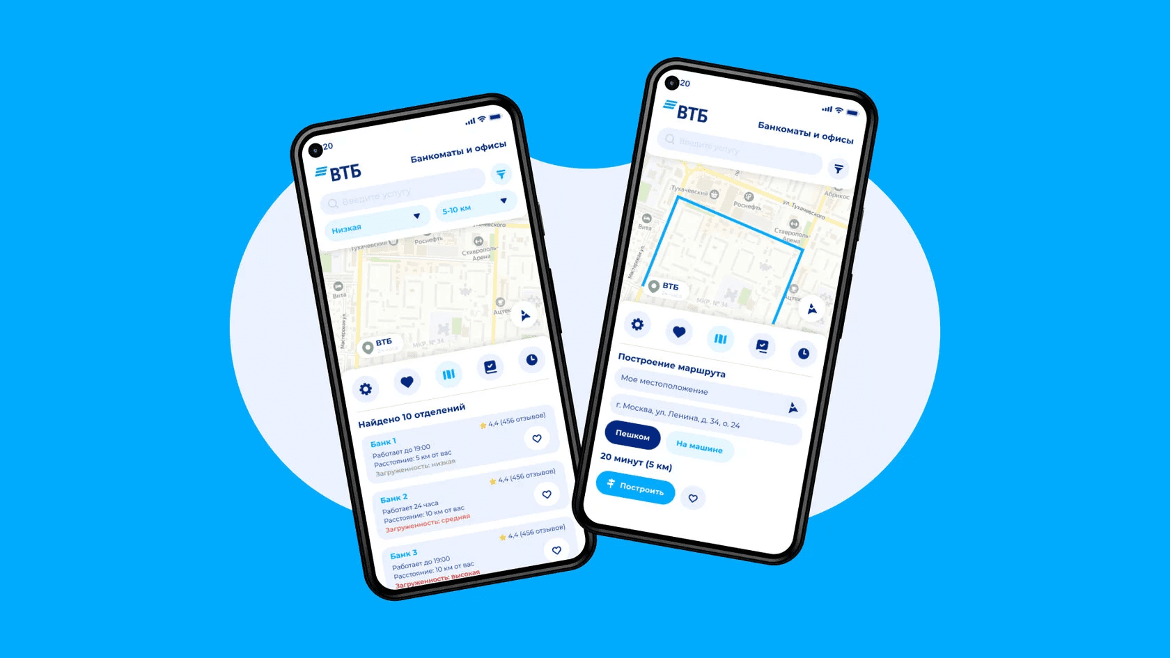
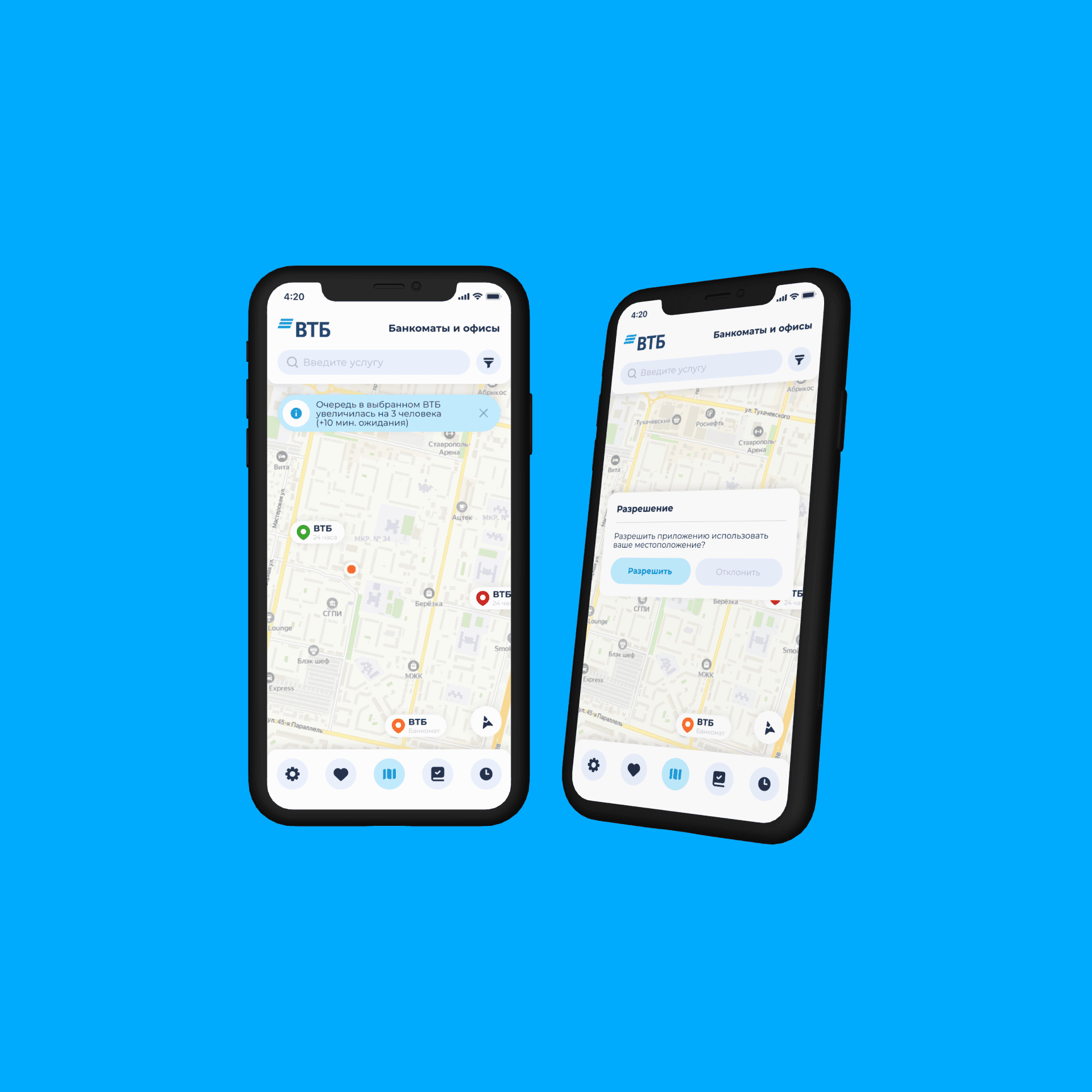
Action: An interface has been developed with a map, where users can easily select the nearest branch using filters to sort by opening hours, availability of required services, and level of congestion.
Result: Users can now find a suitable branch with minimal effort, reducing the time spent searching and waiting.
Department cards with detailed information
Action: Each branch is presented in the form of a card with detailed information about the location, hours of operation, services, and queues.
Result: The cards allow users to quickly assess whether a specific branch is suitable for them and to make an appointment.
Responsive design for mobile devices
Action: The service is designed with all the features of mobile platforms in mind, making it convenient to use both on a computer and on a smartphone.
Result: Access to the service has become as convenient as possible for all users, which has increased their satisfaction and attracted new customers.
Used technologies
Geolocation services: Determining the user's location for personalized recommendations.
Integration with CRM: Allows for automatic appointment scheduling for users and sending them notifications.
Cross-platform support: Full compatibility with mobile devices and desktops.
Design strategy
Main directions
The simplicity and convenience of navigation
The minimum number of steps to find and make an appointment in the necessary department.
Personalized approach
Account for users' locations and preferences for more accurate recommendations.
Interactive maps and filters
Convenient tools for quickly selecting the desired department.
Project results
Increase in the number of appointments by 30%
Users have become more active in using the service for making appointments, which has increased the flow of clients to the offices.
Reducing the time to find a branch by 45%
Search and filter optimization has allowed users to find the necessary branches more quickly.
Increasing customer satisfaction
Customers noted the convenience of the service and its integration with mobile devices, which increased their loyalty to the bank.


