roll-mix
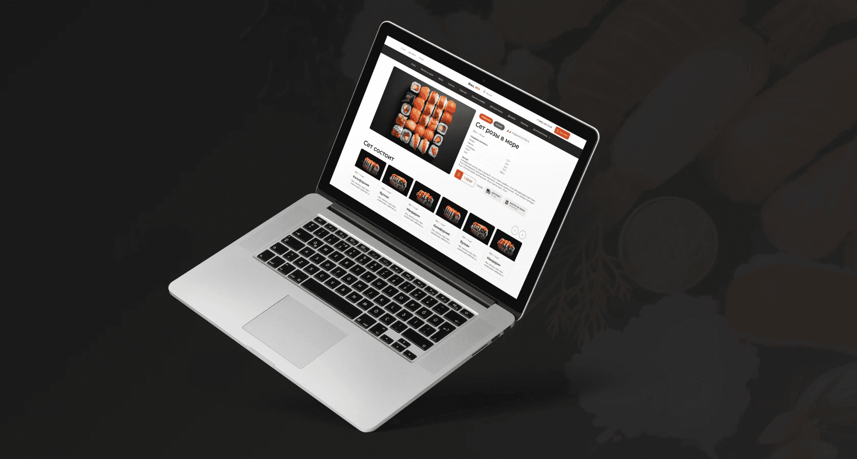
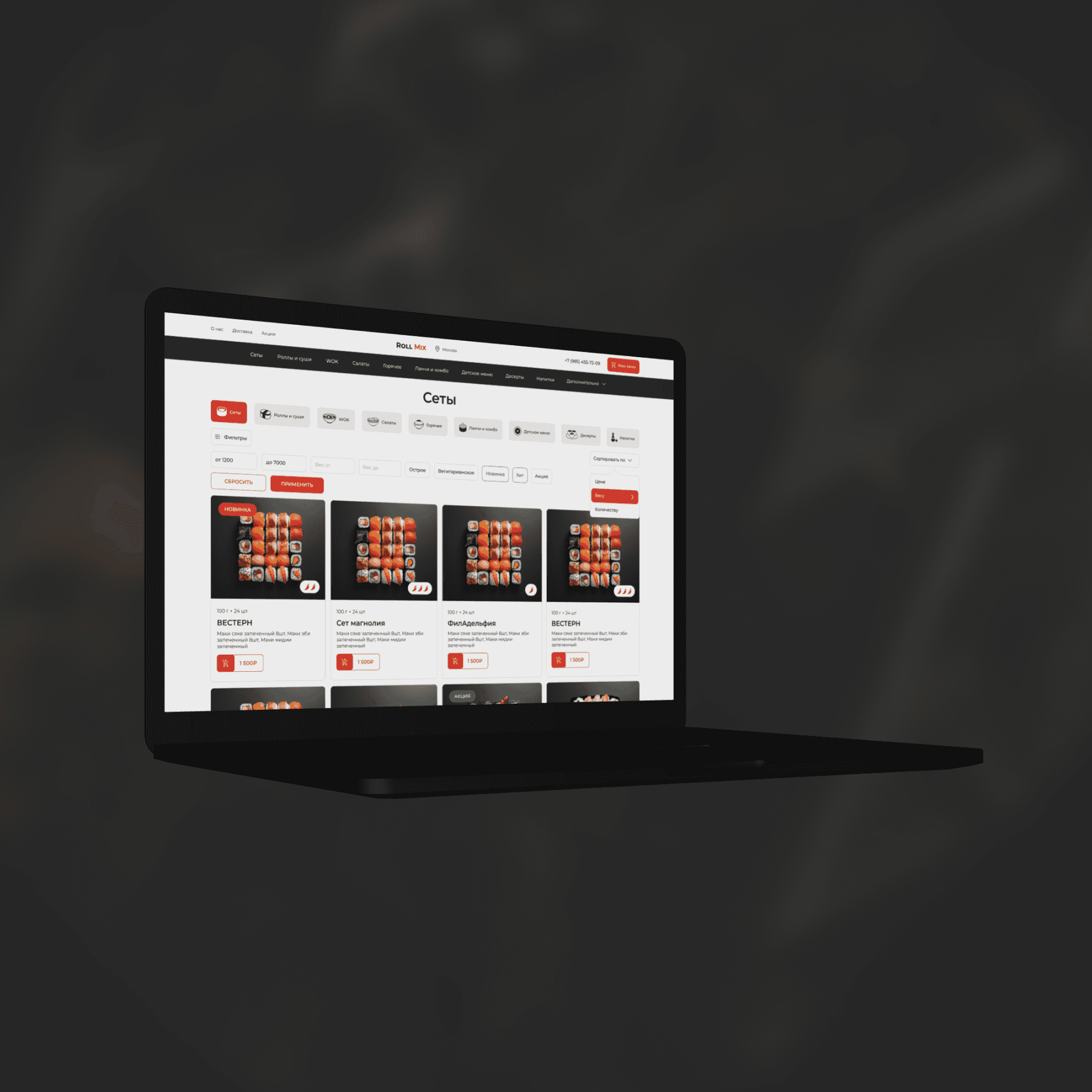
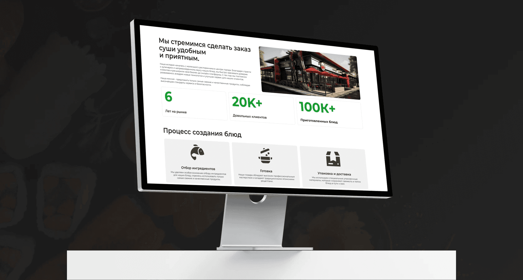
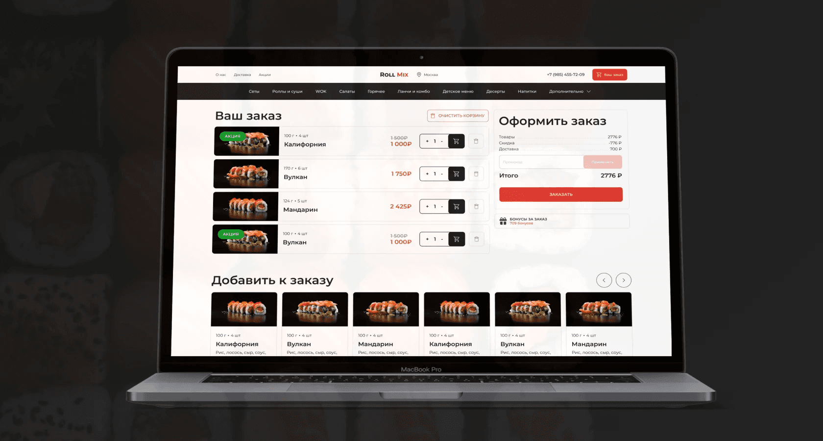
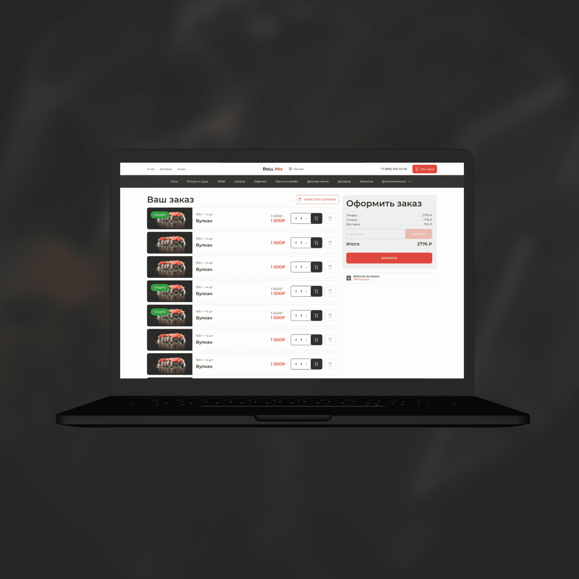
UX research, concept development, and UX/UI design for an online store delivering sushi and rolls. The project aims to create a convenient and functional online service to attract customers and improve the user experience.
Client
A sushi and rolls restaurant that is just entering the market and focuses on convenient home delivery. The client wants to stand out among competitors and become the preferred choice for sushi lovers.
Business goals
Creating a convenient and accessible online service
Develop a user-friendly interface for quick and comfortable home meal delivery, taking into account the needs of the target audience.
Increasing customer satisfaction
Optimize navigation processes and improve the visual perception of the site to increase conversion and attract loyal customers.
Sales growth
Thanks to its ease of use and attractive design, it contributes to increasing the number of orders and returning customers.
Tasks
Inconvenient navigation
Problem
Users faced difficulties placing orders due to confusion in the menu and the complex structure of the website.
Solution
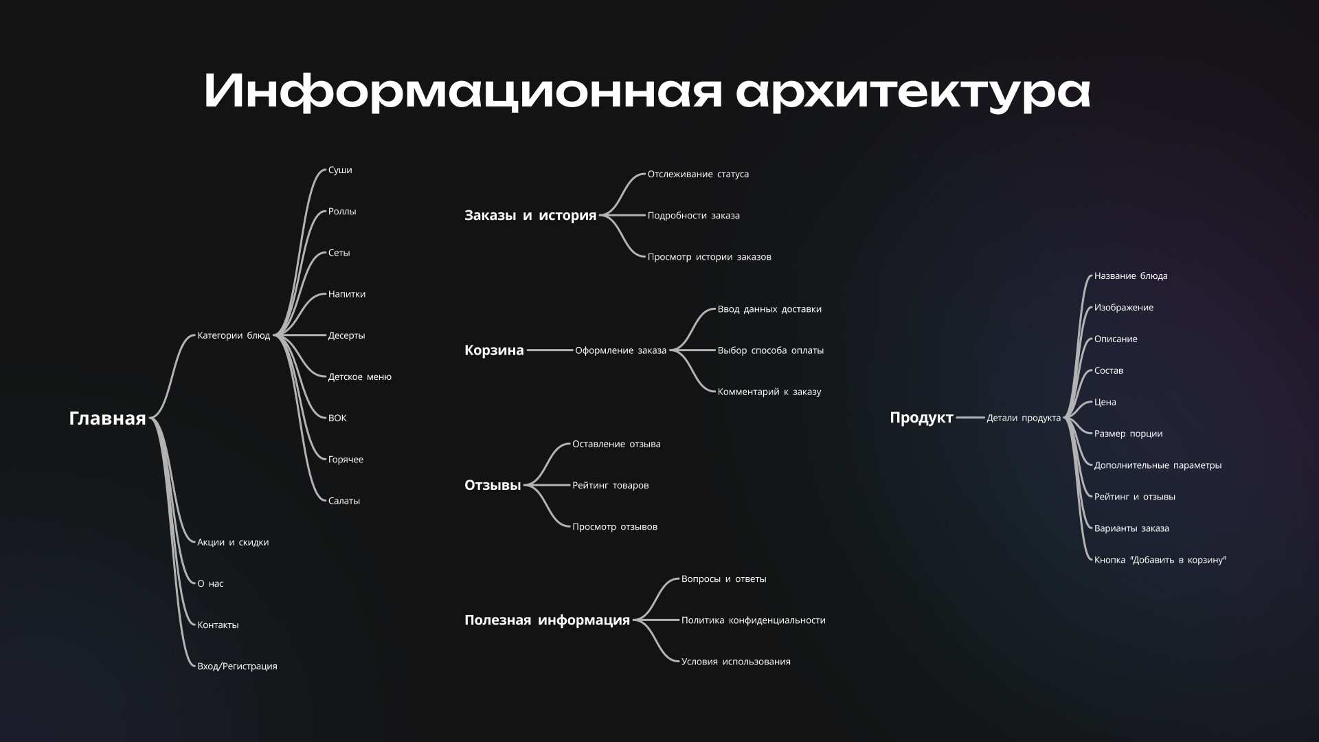
A new navigation structure has been developed, providing easy access to all sections and a simplified path to checkout.
Expressionless visual style
Problem
The absence of a corporate style and unified visual elements lowered the perception of the website and caused confusion among users.
Solution
A design system with unified standards for all UI elements, including buttons, icons, fonts, and colors has been implemented, which increased visual consistency.
Low user conversion to orders
Problem
Users were leaving the site without completing their order due to lengthy and complicated processes of interaction with the site.
Solution
Optimized user flows: the number of steps for checkout has been simplified, intuitive hints have been introduced, and loading speed has been improved.
User Research
and Insights
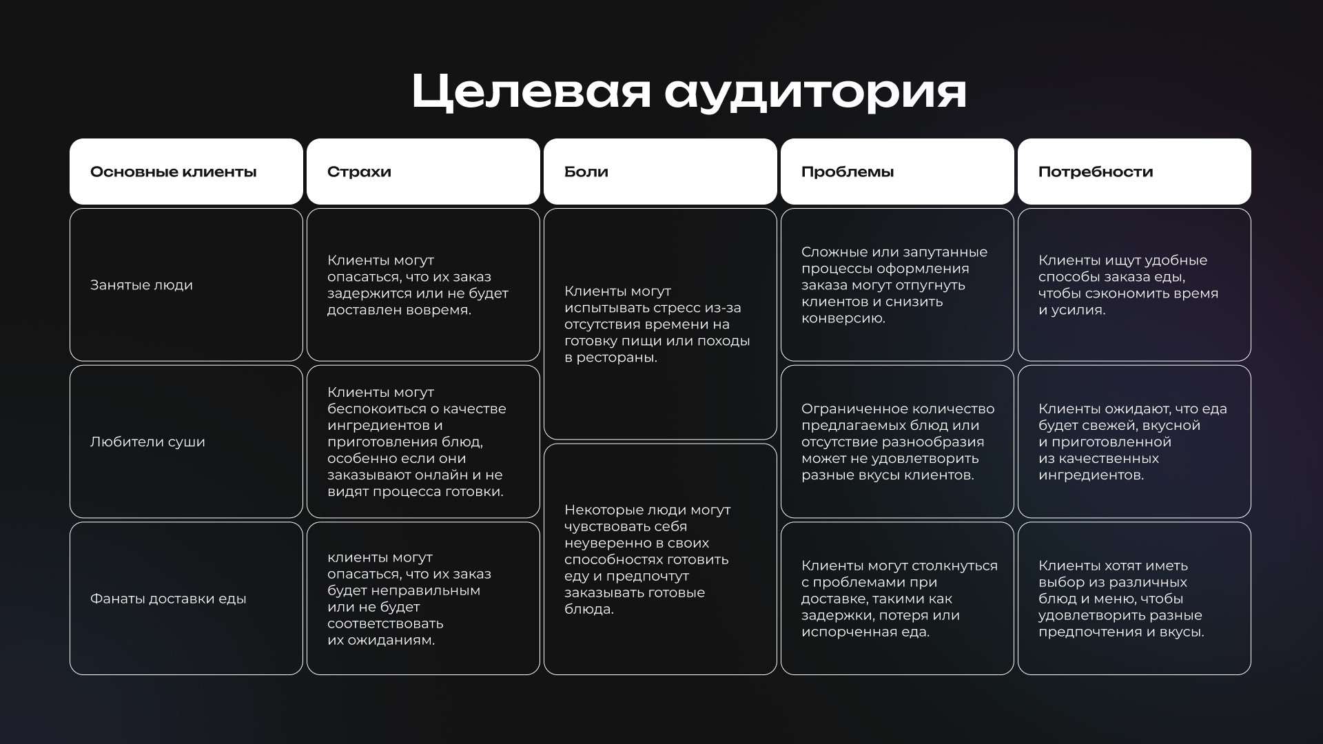
Target audience
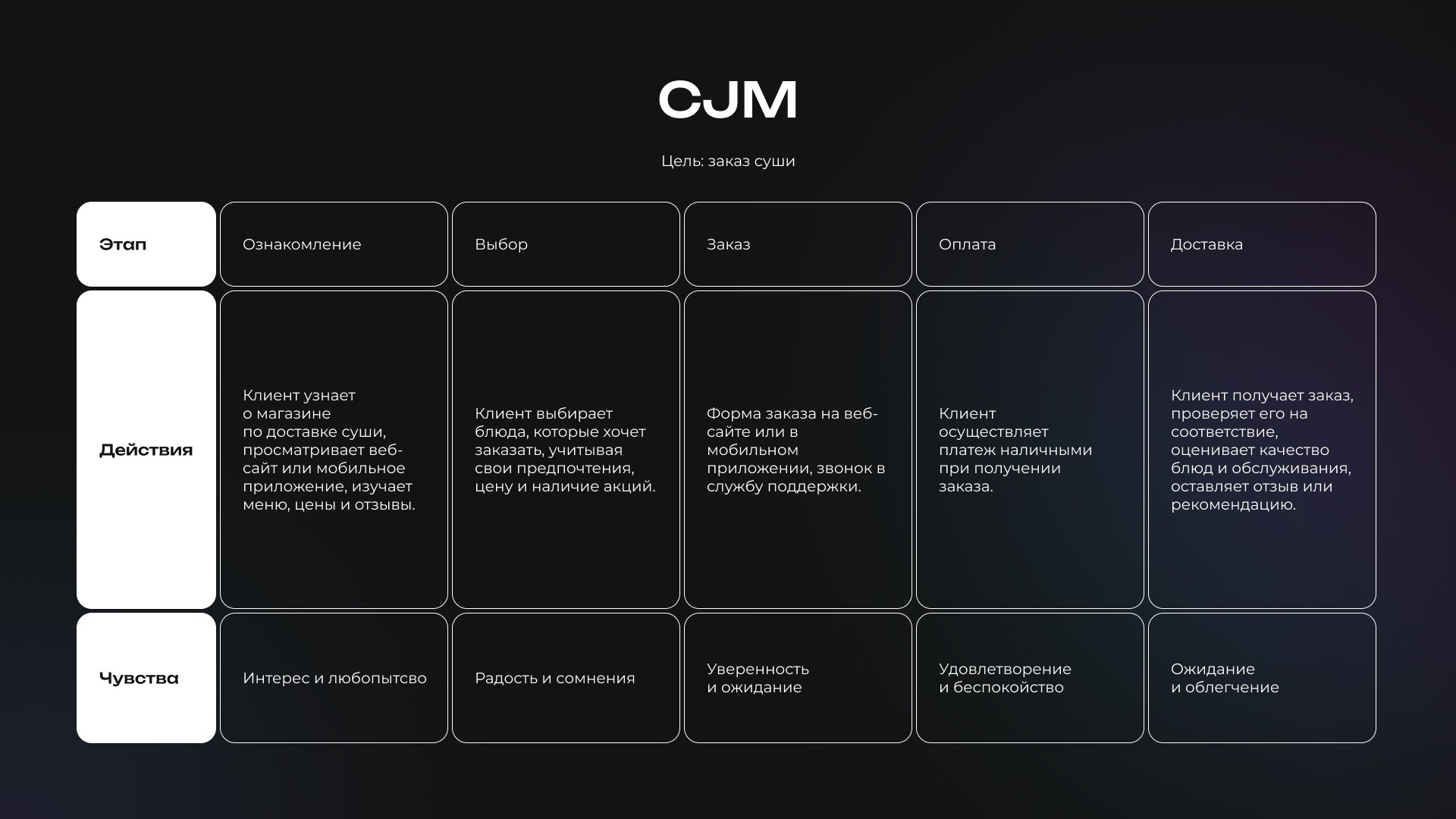
Busy people: need a quick and easy food ordering process to save time.
Sushi lovers: expect high-quality dishes and fast delivery to their homes.
Delivery fans: look for variety in the menu and regular promotions, deals, and discounts.
Users' main needs
A simple checkout process with a minimal number of steps.
A visually appealing and clear interface.
The ability to select dishes by categories and sorting by promotions.
Personas
Anna (28 years old) — Working mom
Goals: To find healthy and quick meals for the whole family.
Pains: Worries about the freshness and quality of food, possible delivery delays.
Maxim (24 years old) — Student
Goals: To order affordable and tasty dishes with a limited budget.
Pains: The fear of overpaying or receiving an incorrect order.
Design solutions
Simplified navigation system
Action: A new navigation structure has been developed with clear sections and a logical hierarchy, allowing users to find the products they need more quickly.
Result: Users can easily navigate the site, which increases conversion rates.
Unified visual design
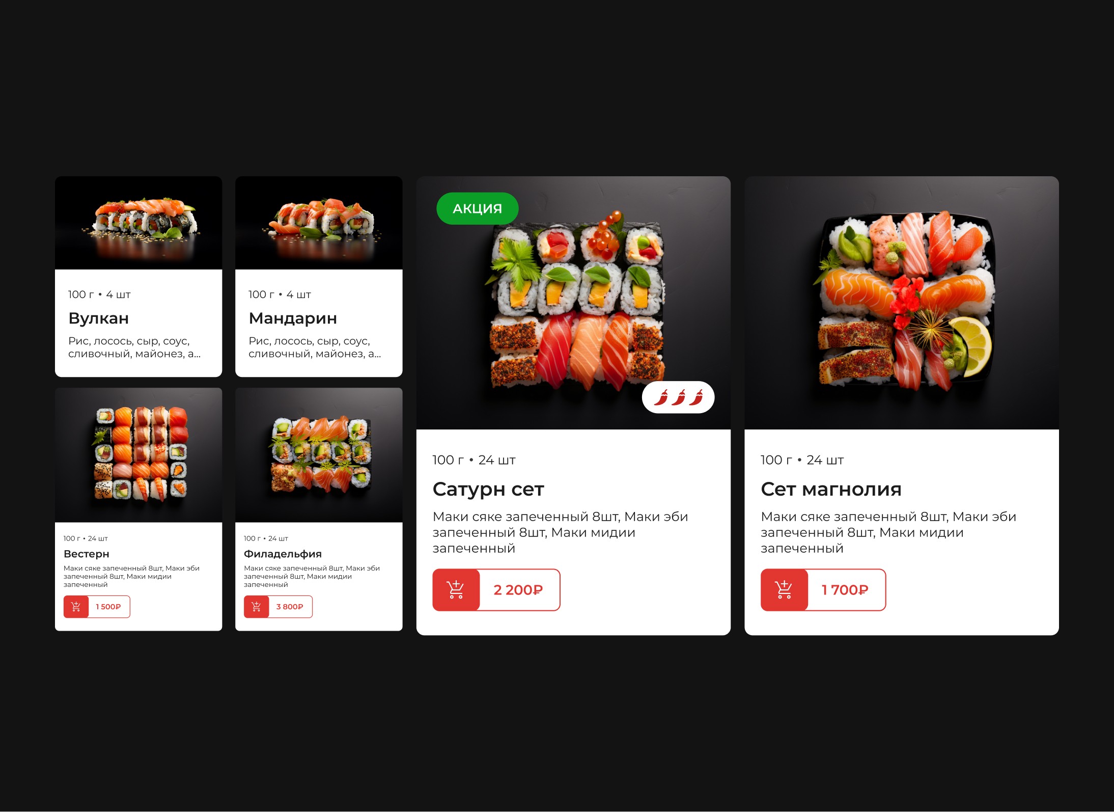
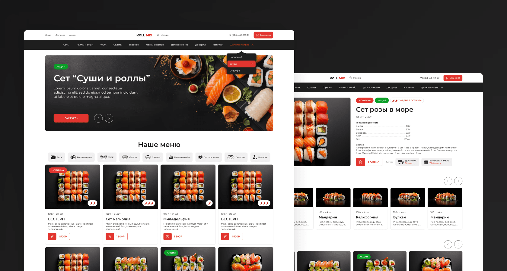
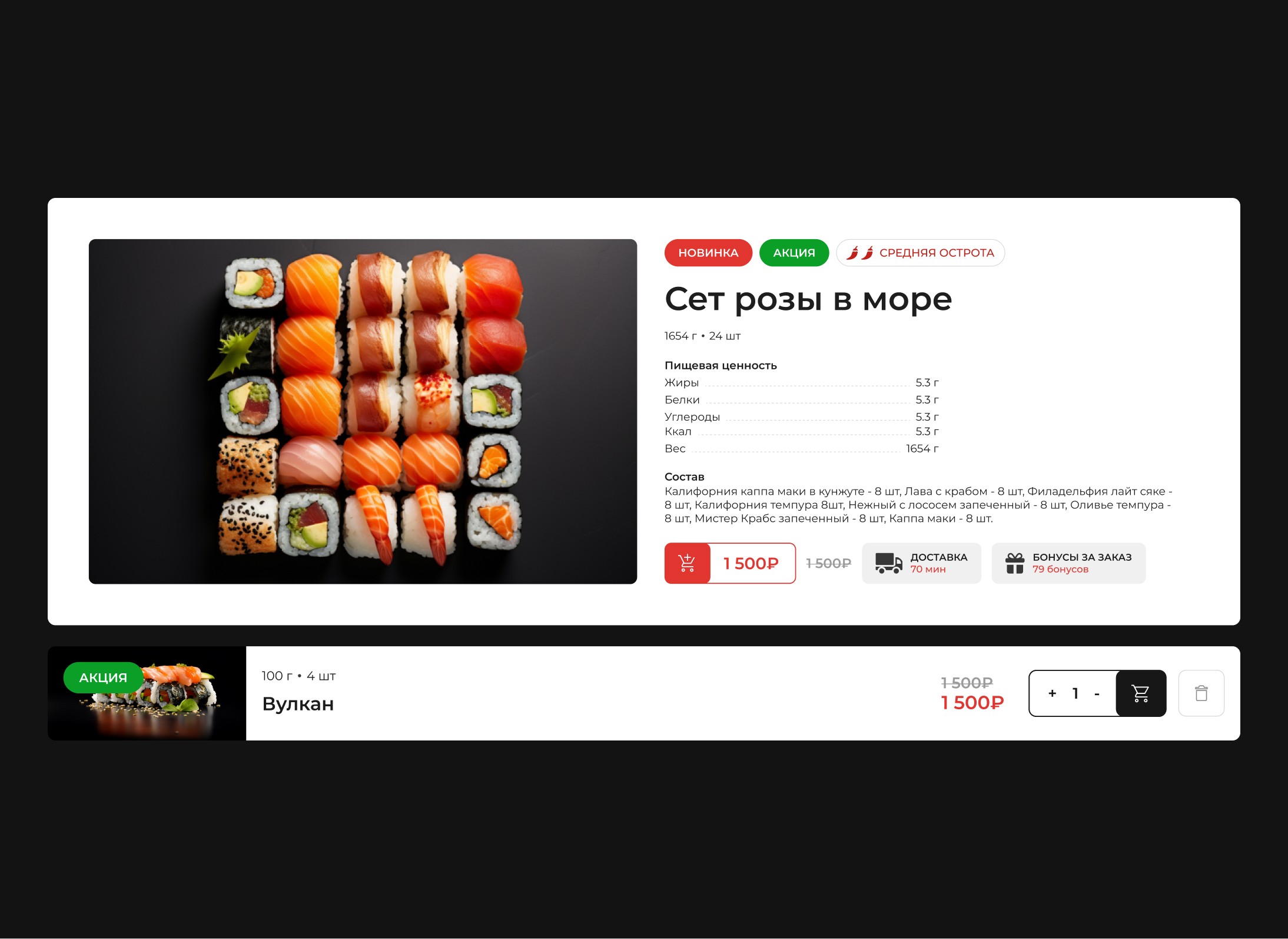
Action: A unified design system was implemented with more than 50 UI elements, including dish cards, buttons, icons, and sections.
Result: Improved visual perception and consistency of the interface, which increased customer trust.
Order process optimization
Action: The steps for placing an order have been simplified, and useful tips for users have been added.
Result: The time required to place an order has been reduced, which has increased the volume of completed purchases.
Adaptive interface
Action: Developed a responsive design for usability across all types of devices, including mobiles and tablets.
Result: Users can easily order food on any device without losing convenience and functionality.
Used technologies
Cross-platform compatibility: Full adaptation of the site for mobile and desktop devices.
CRM integration: Full integration for order management and interaction with clients.
Online payment: Implementation of various online payment methods for user convenience.
Design strategy
Main directions
Improving navigation and interface
Creating a logical structure for quick access to all website functions.
Workflow optimization
Reducing the number of steps to complete an order by introducing intuitive prompts and improved navigation.
Interface personalization
The development of an interface focused on the needs of different types of users (sushi lovers, busy people, and delivery fans).
Project results
Conversion growth
Increase in completed orders by 35% thanks to a simplified navigation and checkout system.
User satisfaction
Customers note the high speed of order processing and the pleasant visual style.
Attracting repeat customers
The service has become convenient and intuitive, which has contributed to the return of users to the site for repeat orders.


